Redesigning candidate management at MightyRecruiter
Making recruiter workflows easier to scan, prioritize, and act on without losing context between candidates
UX Designer at Bold working on MightyRecruiter, an HR tech SaaS for sourcing and hiring. Over 14 months I led redesigns across candidate management, screening, and the main dashboard. The work started when rising cancellations traced back to a workflow that forced recruiters out of context every time they needed to read or act on a candidate. The redesign cut time-on-task 33%, dropped subscription cancellations 7%, and landed an 87% excellent or good satisfaction rating in post-launch research.
Two views, no connection

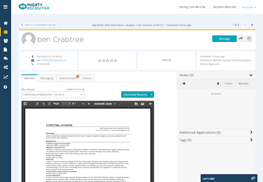
To act on a candidate, you had to leave them
Every advance, reject, or stage change meant navigating away from the list, losing place, and navigating back. The design question wasn't what to add. It was how to eliminate the exit entirely.
How we got there
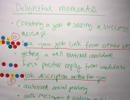
Customer conversations, SME surveys, and churn tickets all pointed to the same thing: not missing features, but too much time spent inside the workflow.
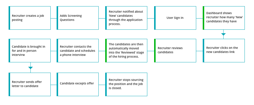
10 people across leadership, research, engineering, and analytics mapped the hiring journey to agree on where to focus.
Diagramming the full recruiter workflow made the exit-and-return pattern impossible to miss.
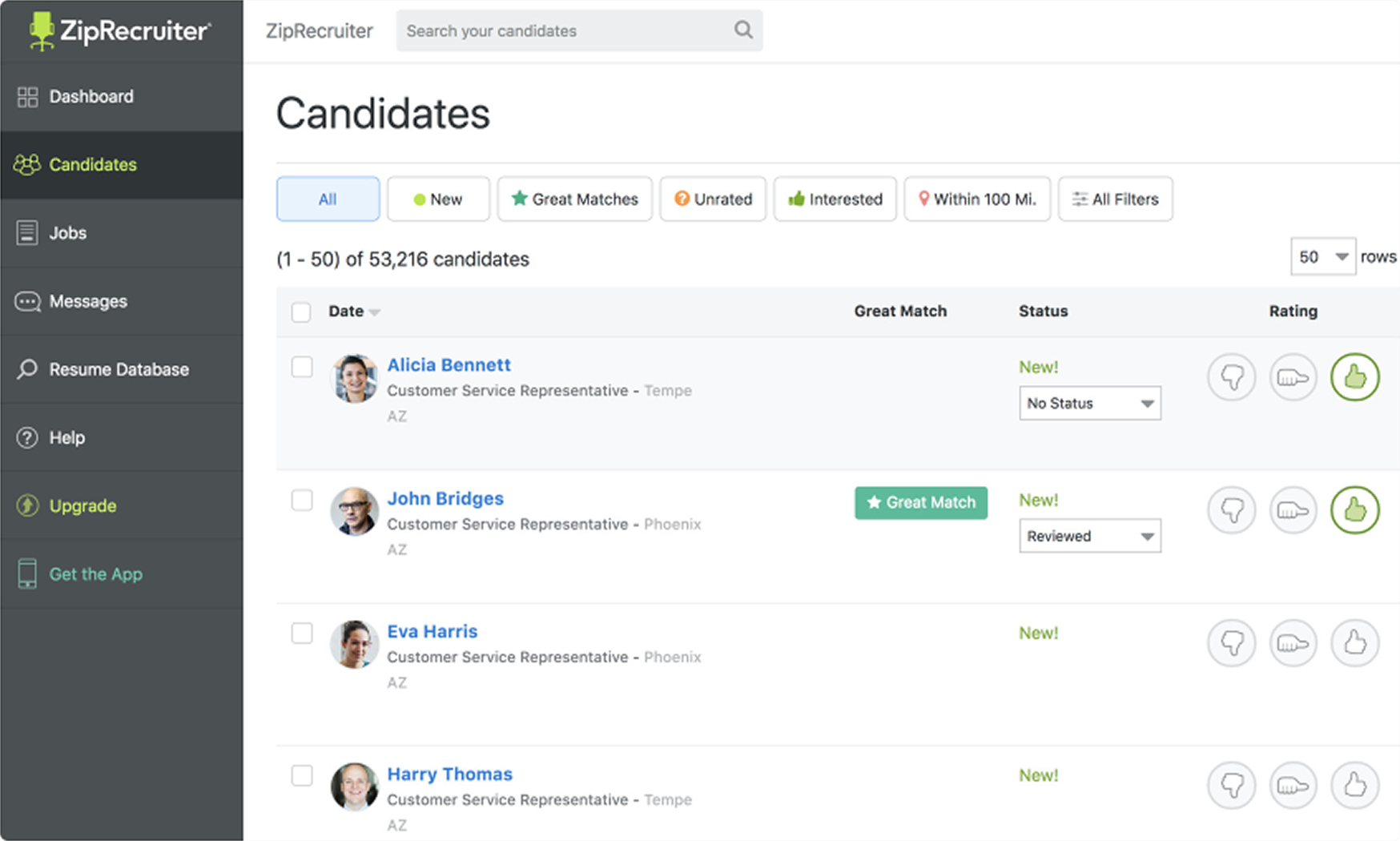
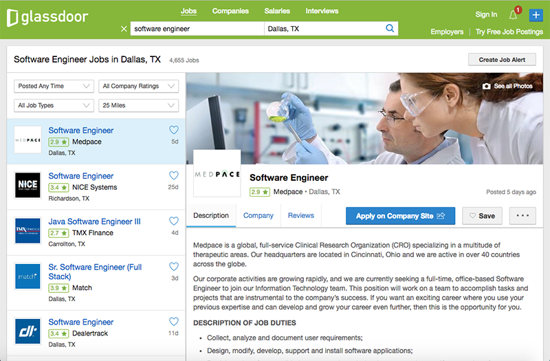
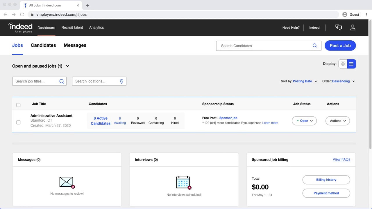
ZipRecruiter, Glassdoor, and Indeed all handled high-volume list-detail interactions. The split-panel pattern was already the emerging standard.
Competitive reference
Two directions
Candidate Lightbox
A focused modal per candidate, navigated with previous and next arrows. Keeps attention on one candidate at a time, but breaks the list context entirely on each open.
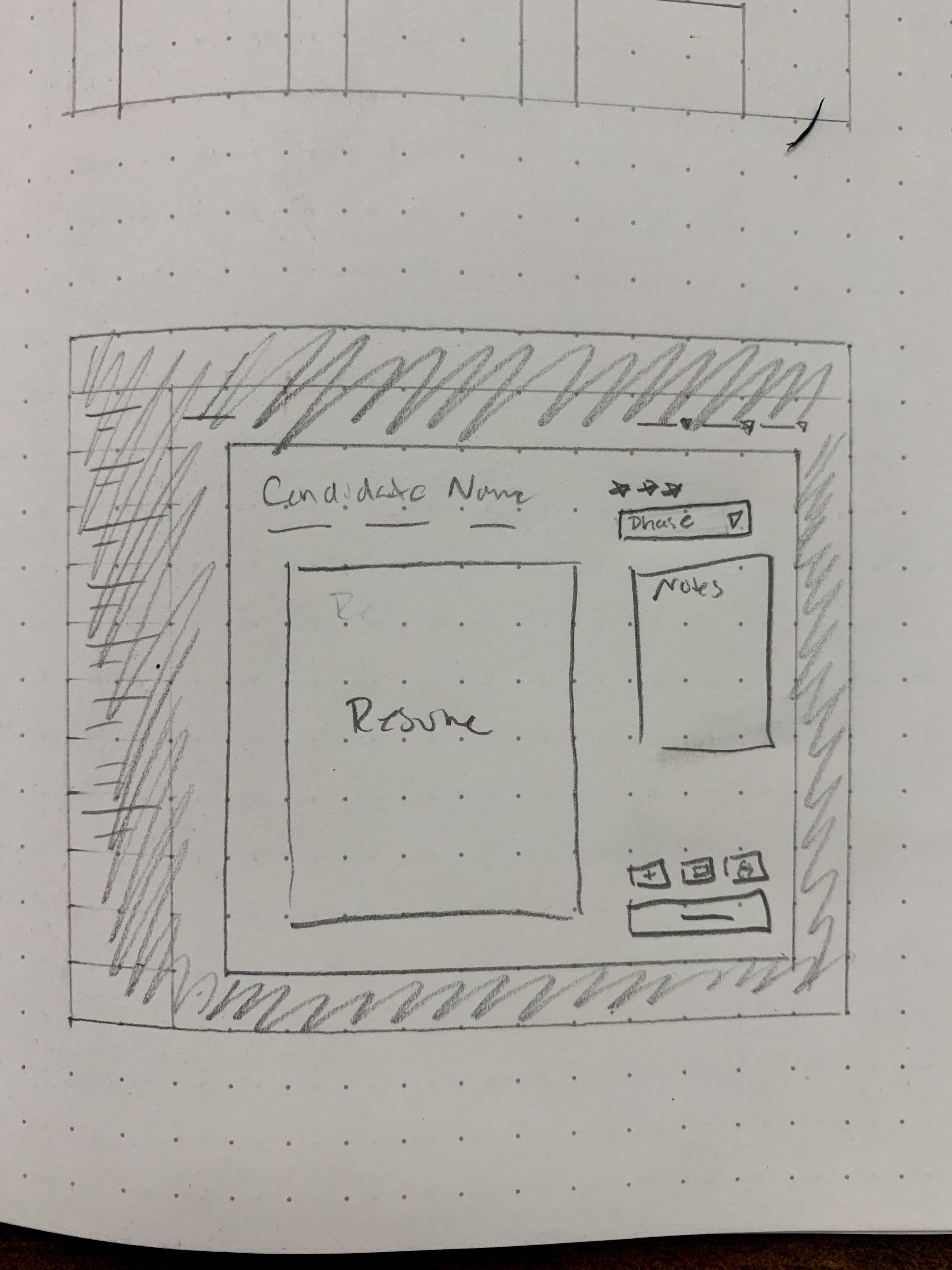
More clicks per candidate when processing large pipelines. Rapid feedback from internal recruiters flagged loss of list context as a real problem for high-volume work.
Split-Panel View
A persistent candidate list on the left, with a detail panel on the right. Select a candidate to see their resume, notes, and stage controls without navigating away from the list.
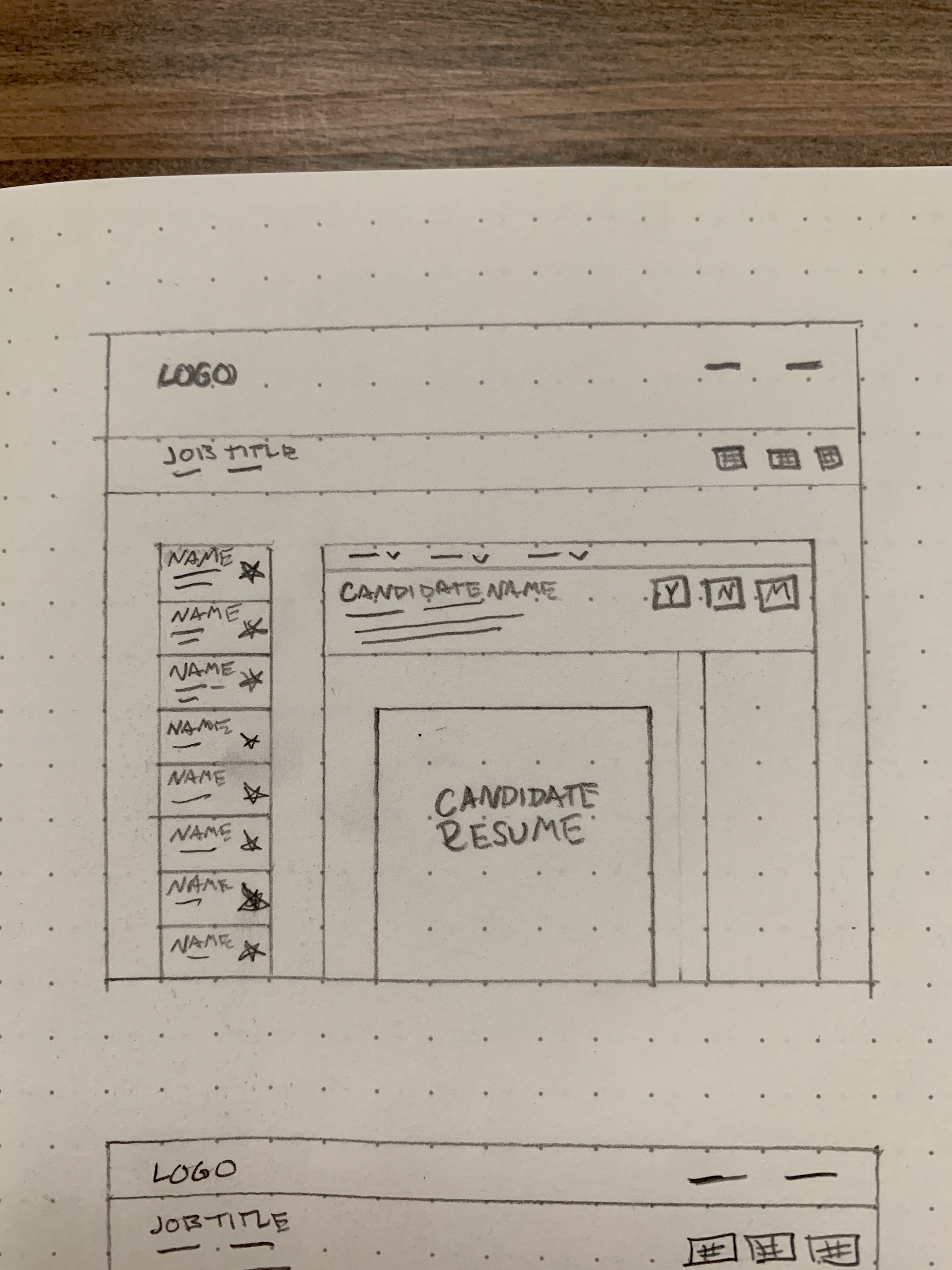
Eliminated the exit-and-return loop entirely. Recruiters can read, rate, message, and advance candidates in a single continuous session. The list stays in view the whole time.
Before and after
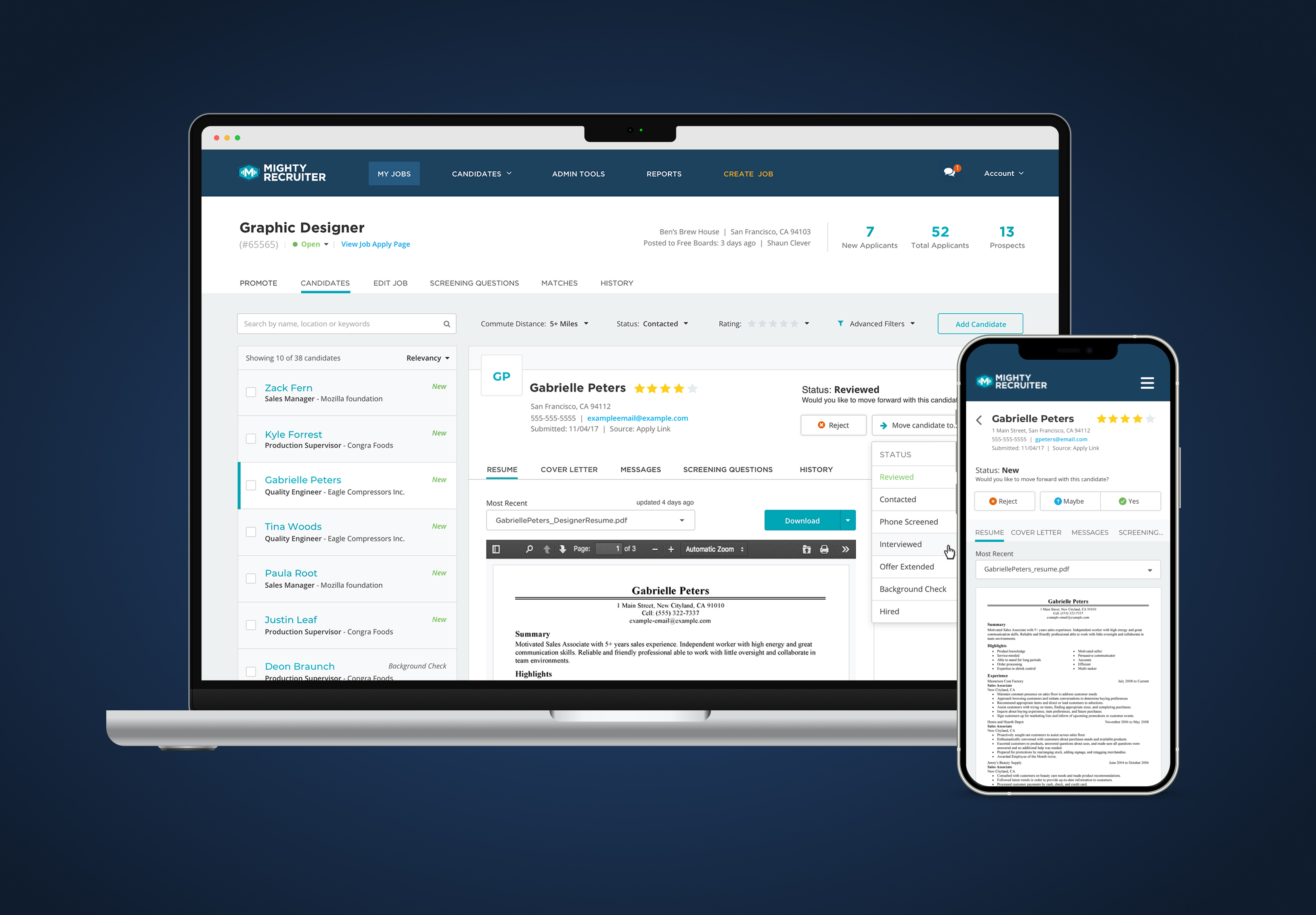
Mobile
The same hierarchy decisions in a single-column format, status surfaced immediately, stage controls one tap away, resume accessible without a separate page load.
33% faster
Three internal recruiters. Same end-to-end task on baseline and new design.
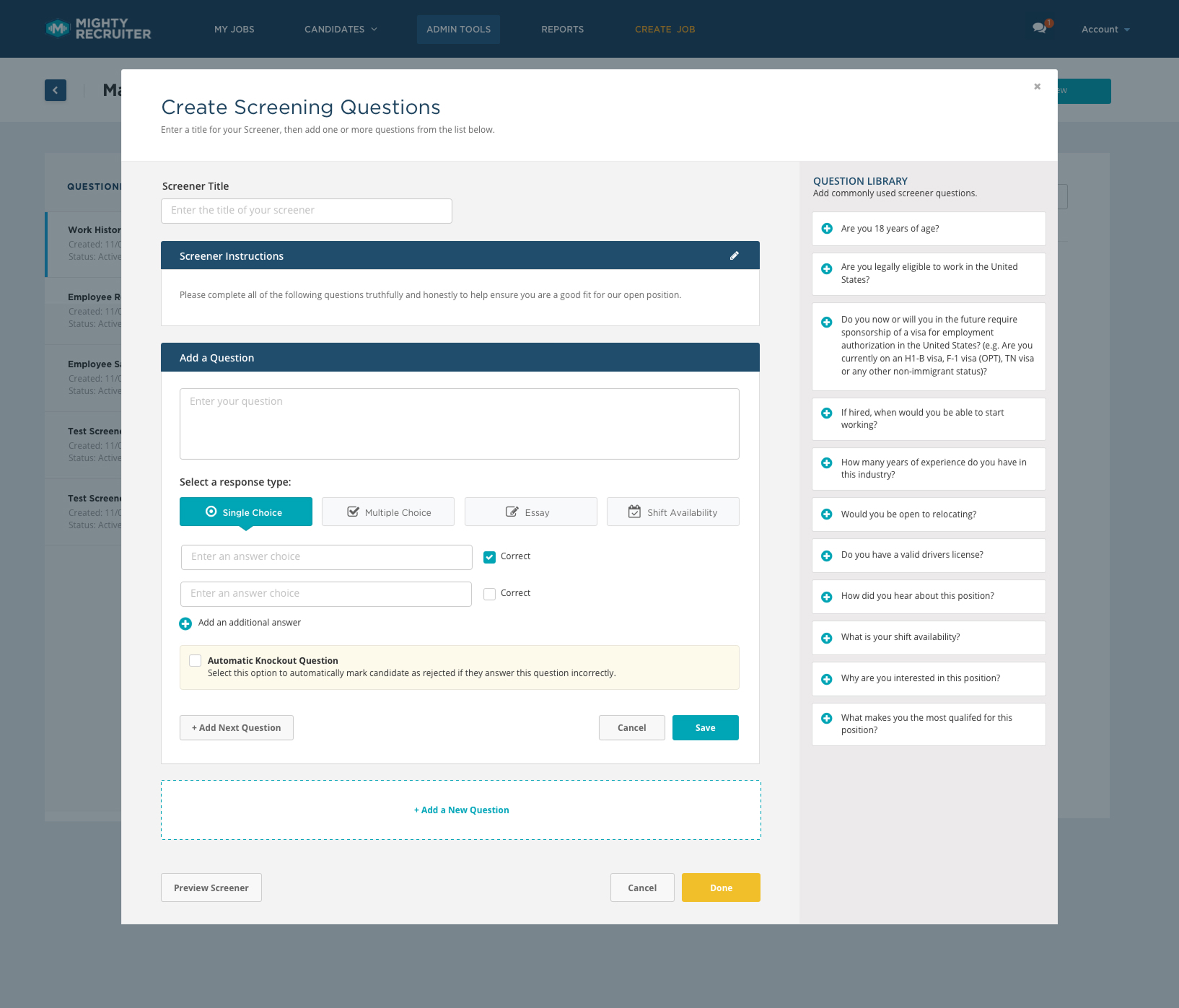
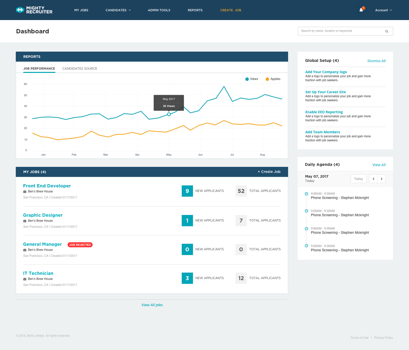
Companion projects
Impact
Overall, how would you rate MightyRecruiter?
31 participants surveyed after candidate management shipped