Resume Builder Redesign at Resume-Now
Redesigning a builder that hadn't been touched since 2008 to help millions of job seekers create better resumes and feel confident purchasing
UX Designer at Resume-Now (Bold) in 2020. Led a 10-week redesign of the core resume builder, owning research through visual design for a product reaching 15 million monthly visitors. Ran 5 rounds of unmoderated testing with 56 participants. Shipped to a 20% lift in example content usage and a 3% increase in subscription conversions for first-time users.
Editing hid the resume. Help wasn't relevant.
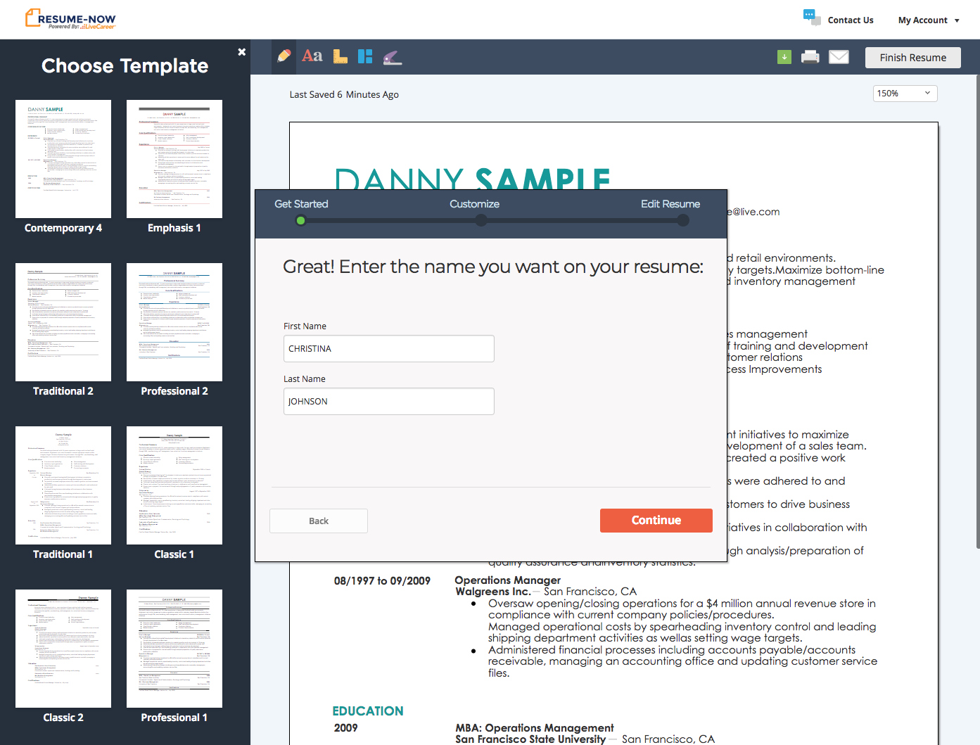
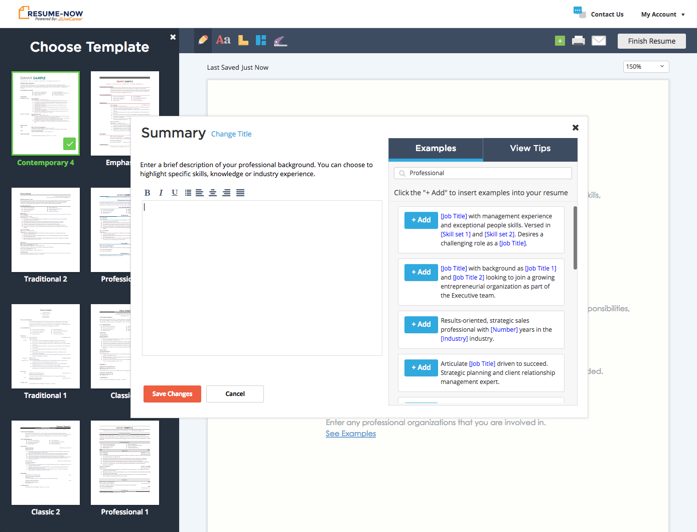
The builder hadn't been updated since 2008. Every section opened in a modal that covered the resume entirely; you couldn't see what you were building while building it. The example content library, which 85% of subscribers relied on, surfaced generic sentences with no job title filtering. Noise rather than help.
Editing blocked the resume. Examples weren't relevant.
Five rounds, one question at a time
Each round tested two competing approaches against a single design question. Results fed directly into the next prototype, from layout to content interaction to navigation.
9 of 10 participants preferred the side panel layout over any format that hid the resume. Real-time updates as they typed was consistently the most delightful moment across testing.
Users appreciated example content but needed to feel in control of the final result. Browseable, one-click sentences beat auto-generated descriptions, when the system did too much, users felt like they'd lost the wheel.
Half of participants instinctually clicked on a resume section to start editing it. In the session testing this directly, 10 of 10 used resume navigation, nobody touched the dedicated section nav list.
Filtering TTC by job title made example content feel written for the user. A shorter, filtered list outperformed the full unfiltered library, relevance drove engagement more than volume.
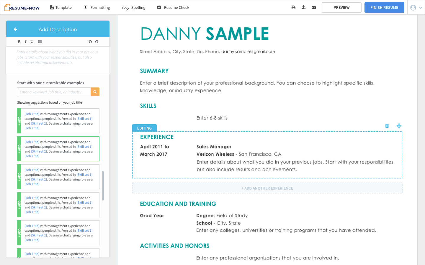
The modal is gone. The resume is always visible.
Three decisions
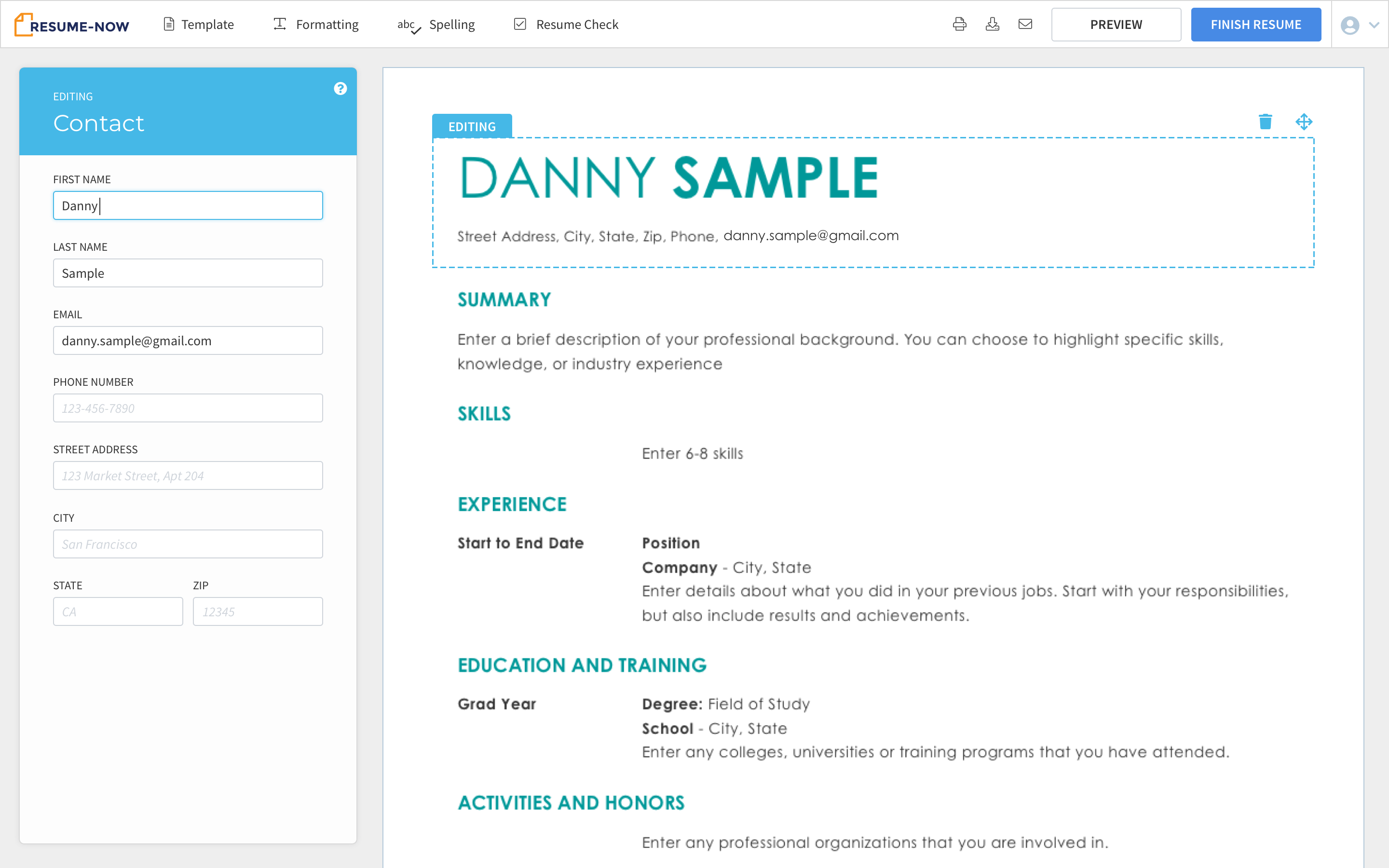
Side panel + live preview
Form fields in the left panel, resume always visible on the right. Confirmed in Session 1: 9 of 10 preferred this over any layout that hid the document.
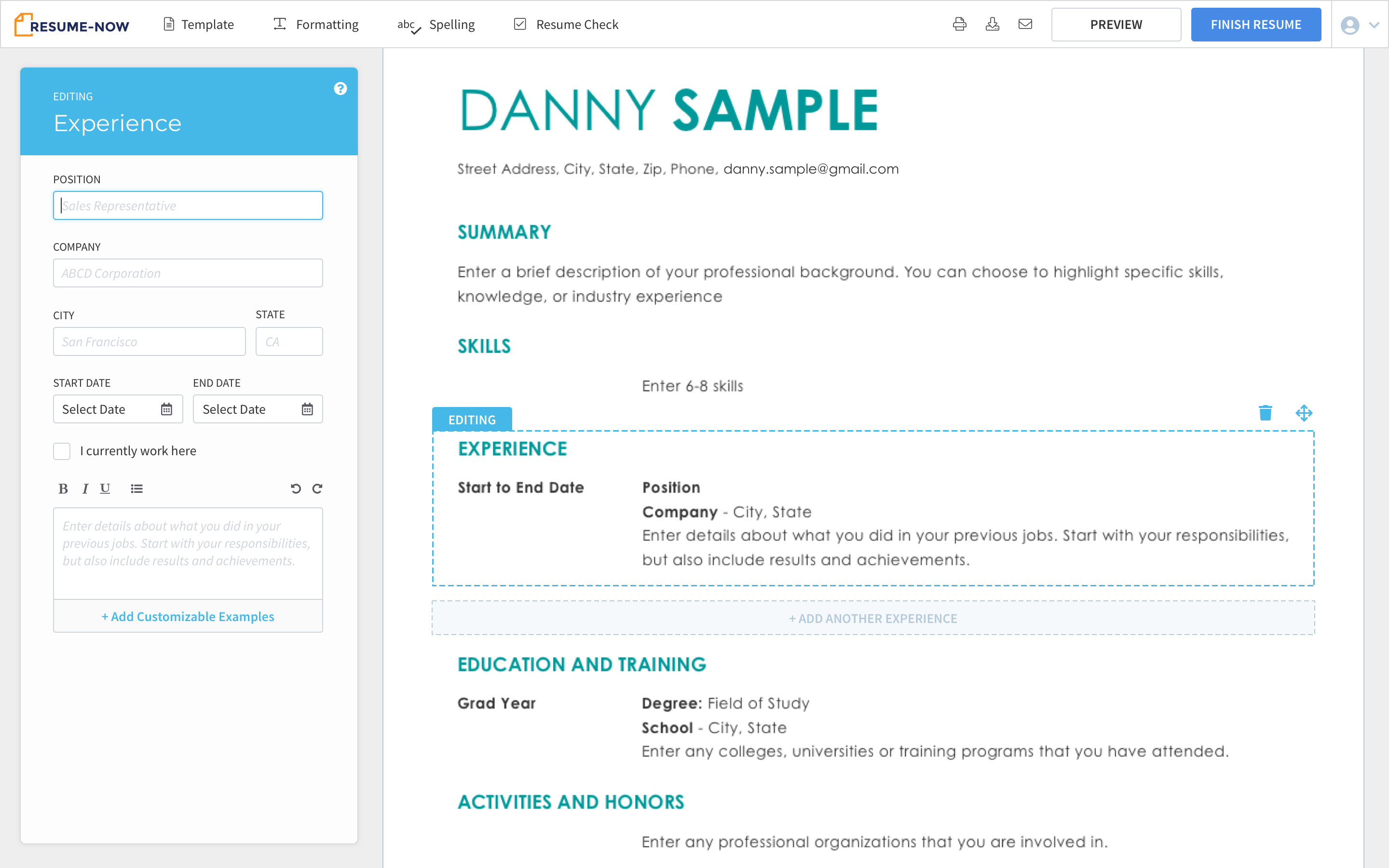
Click the resume to navigate
Click any section of the resume preview to open it for editing in the side panel. The document is the menu. Confirmed in Session 5: 10 of 10 used this naturally.
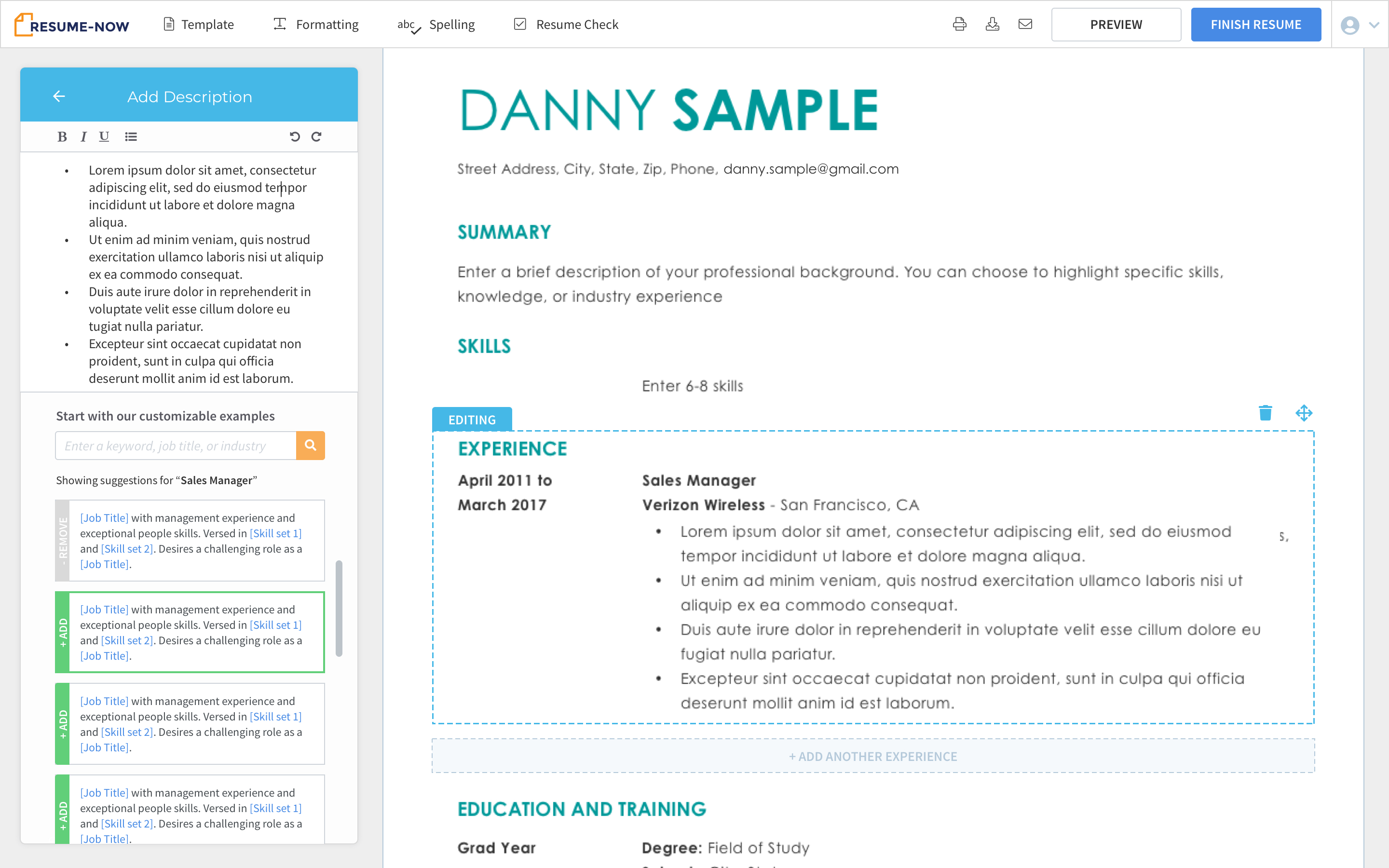
Job-title-filtered TTC
Enter a job title, the example library filters to match. One click adds any sentence to the text field. Confirmed in Session 4: users described it as more straightforward and closer to their expectations.
+20% example content usage. +3% subscription conversions for new users.
Two months of A/B testing. Example content engagement up 20%, subscription conversions for first-time users up 3%. None of these were new features; they were the right model for what users were already trying to do.